How Often Should You Replace Your Toilet? Complete Guide
Buying Guides4.6
Most toilets last 25 to 50 years, but the smart replacement window is usually the 20-year mark. Here is what the signs,…
Read the guideChoosing the right palette for your bathroom affects how large the space feels, how easy it is to keep clean, and whether your fixtures -- from your TOTO Drake to your Kohler Highline -- look their best. This guide covers the color psychology, practical data, and combination rules that interior designers and renovation professionals rely on.
Research updated June 2026.
For most bathrooms, a light neutral base (soft white, warm greige, or pale sage) paired with one accent color in accessories or a single accent wall delivers the most versatile, buyer-friendly result. High-contrast dark colors work well in large bathrooms but visually compress small spaces. Tile grout color matters as much as wall paint -- match grout to tile for a seamless, larger-feeling floor.
Bathroom color decisions are permanent in a way that repainting a living room is not. Tile is expensive to replace, grout soaks up pigment, and fixtures -- toilets, tubs, vanities -- come in a narrow range of whites, bisques, and blacks. Getting the palette right from the start saves significant cost and prevents the most common renovation regret: a bathroom that feels dark, claustrophobic, or dated within two years.
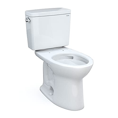
This guide covers every decision layer: wall paint, tile color, grout selection, fixture finishes, accent strategies, and the specific combinations that professional remodelers recommend -- and the ones they warn against. It also addresses how your best flushing toilets and other white porcelain fixtures interact with surrounding colors, because fixture white is not a neutral -- it reacts to everything around it.
Light values -- off-whites, pale grays, warm creams, and very soft greens -- consistently make small bathrooms read larger because they reflect more light and reduce visual weight on walls and ceiling. Monochromatic schemes (keeping wall, tile, and grout in the same tonal family) are especially effective because the eye travels across the space without interruption, eliminating the horizontal line that darker grout creates at floor level. A single accent in a towel, plant, or hardware finish adds interest without sacrificing the sense of space.
Light reflectance value (LRV) is the percentage of visible light a paint color reflects. A pure white registers near 100; a deep charcoal near 3. In a bathroom under 50 square feet -- the average half-bath -- each 10-point LRV drop on the walls measurably reduces perceived square footage because less light bounces back from surfaces. Brands publish LRV on every paint chip. Sherwin-Williams Alabaster (SW 7008) has an LRV of 82. Benjamin Moore Chantilly Lace (OC-65) sits at 92.2. Both are popular bathroom choices for this reason.
Tile compounds the effect. A 12x24 large-format floor tile in light gray with matching grout (a near-zero grout line visually) makes a 6x8 bathroom floor appear closer to 8x10. The same tile with dark charcoal grout breaks the floor into a grid and visually shrinks it.
Renovation specialists consistently recommend keeping the LRV difference between wall color and grout color within 15 to 20 points in bathrooms under 60 square feet. The goal is a continuous tone that lets the eye flow, not a mosaic that telegraphs every 12 inches of tile edge. This single rule eliminates the most common visual crowding mistake in small bathroom remodels.
Mid-tone matte or eggshell wall finishes in warm grays, taupe, and soft sage hide water splashes, toothpaste marks, and general condensation residue better than bright whites or very dark colors. Bright white shows every smudge and fingerprint; deep charcoal and navy show water mineral deposits and soap scum as light-colored streaks. Mid-tones split the difference, providing a backdrop that masks day-to-day soil without requiring daily wiping down.
Glossy white subway tile is the most popular bathroom tile choice in the United States -- and also one of the highest-maintenance. The gloss surface shows soap scum readily and requires weekly cleaning with a squeegee or spray to stay presentable. Matte or honed tile finishes in the same color hide water spots more effectively. Large-format rectified tiles with minimal grout lines -- regardless of color -- are faster to clean than small mosaic tiles with extensive grout coverage. Grout itself is the hardest surface to keep clean: gray, warm beige, or charcoal grout stains far less visibly than white grout over a five-year period.
Porcelain fixtures from brands like TOTO, Kohler, American Standard, and Woodbridge use vitreous china with a high-gloss glaze that resists staining, but the white color shows limescale deposits in hard-water areas. If your area has water hardness above 180 mg/L (considered very hard by USGS standards), wall and floor colors that lean warm -- cream, warm gray, taupe -- tend to minimize visual contrast with the mineral-stained whites of toilet bowls and sinks. See our guide on hard water and toilet selection for fixture-specific guidance.
| Color Scheme | Best Room Size | Maintenance | Resale Appeal | Works With White Fixtures |
|---|---|---|---|---|
| Warm White / Soft Greige | Any size | Medium (mid-LRV) | Excellent | Seamless |
| Pale Sage Green | Small to medium | Good | Very good | Complementary |
| Soft Blue / Spa Blue | Any size | Good | Very good | Complementary |
| Bright White | Any size | Poor (shows every mark) | Good | Matches but competes |
| Charcoal / Slate | Large only | Poor (shows mineral deposits) | Moderate (niche appeal) | High contrast -- intentional look |
| Navy Blue | Large only | Poor (shows streaks) | Moderate | Bold contrast |
| Warm Beige / Cream | Any size | Very good | Good | Slightly warm against cool white |
| Terracotta / Warm Rust | Medium to large | Good | Moderate (trend-dependent) | Warm contrast; dated risk |
| Black and White | Any size | Poor on both ends | Very good (classic) | Strong; white fixtures disappear into white |
| Monochromatic Light Gray | Small to medium | Very good | Very good | Excellent with cool-white fixtures |
Yes -- strongly. White porcelain fixtures (toilets, sinks, tubs) have undertones that shift based on surrounding colors. TOTO and Kohler Cotton White reads slightly warm; American Standard White reads marginally bluer; Kohler Almond and TOTO Sedona Beige are distinctly warm. Placing a cool stark-white fixture against a warm cream wall makes the fixture look grayish or cold. Placing a warm-white fixture against bright white tile makes the fixture look yellow. Matching fixture undertones to wall undertones is a critical but often overlooked step.
Every major toilet and fixture brand offers multiple white colorways. The most common are:
Before choosing wall paint, bring home paint chips and hold them next to your actual toilet tank or sink. A color that looks neutral on a chip will shift against porcelain. Most paint brands sell sample quarts -- paint a 12x12 area near the toilet and evaluate in both natural and artificial light before committing to a full room.
Color temperature of bathroom lighting amplifies fixture undertone effects. Warm-toned LED bulbs (2700K to 3000K) make cool-white fixtures read yellowish. Daylight-range bulbs (5000K to 6500K) make warm-white fixtures appear gray. Neutral white bulbs (3500K to 4000K) are the standard recommendation for bathrooms specifically because they reduce undertone distortion from both fixtures and wall colors. Changing bulb color temperature is often cheaper than repainting to fix a mismatched look.
The combinations most consistently cited as problematic by renovation professionals are: high-LRV difference between grout and tile in small bathrooms (creates a grid effect that shrinks the room); warm fixture whites against cool stark-white walls (fixture reads dirty); dark matte paint finishes in windowless bathrooms (amplifies mold and mildew growth in grout because the visual inspection misses early colonization); and strongly saturated accent walls behind the toilet (the toilet interrupts the focal point awkwardly). These are not rules -- they are documented patterns of buyer and homeowner dissatisfaction.
White grout is the single most common bathroom color decision that homeowners regret. According to survey data collected by the National Kitchen and Bath Association (NKBA), grout discoloration and staining rank among the top five renovation regrets in bathrooms -- and white grout is three to four times more likely to discolor visibly than gray, tan, or charcoal alternatives. Epoxy grout in white resists staining better than sanded or unsanded cement grout, but even epoxy grout collects mildew in humid conditions over several years. Gray grout at 40 to 60% lightness value hides biological growth and iron staining from old pipes far more effectively.
Navy accent walls, dark forest green feature walls, and deep terracotta bathroom accent walls are frequently shown in design publications in large, well-lit bathrooms with skylights and generous square footage. The same palette applied in a 35-square-foot powder room under a single 60-watt equivalent LED produces a cave, not a spa. Before committing to a saturated accent color on a wall, measure the room's light source -- natural lumens per hour from windows plus artificial fixture wattage. Rooms without natural light almost always require high-LRV walls to feel functional.
The "feature wall" behind the toilet tends to draw the eye toward the toilet -- the least glamorous focal point in most bathrooms. Feature or accent wall treatments typically work better on the wall the toilet faces (directly across from the seat) or on the wall behind the vanity and mirror, where the visual reward is higher. Wallpaper, textured tile, or a bold paint color behind the vanity frames the mirror and creates a grooming station effect that reads as intentional rather than accidental.
Real estate data from Zillow and the National Association of Realtors consistently shows that neutral to mildly warmed-up bathroom palettes -- soft whites, warm grays, greige, and pale sage -- yield the broadest buyer appeal and correlate with faster sale times. Strongly saturated colors (navy, terracotta, black) appeal to a segment of buyers but alienate a larger segment, particularly in mid-market homes. The safest approach for resale is a neutral base with personality introduced through accessories, hardware finishes, and lighting -- elements buyers understand they can change cheaply.
Fixture hardware -- faucet, towel bar, toilet flush handle, toilet paper holder -- acts as a color in the room because it introduces metallic undertones that bounce light in specific ways. The four dominant finish categories each pull the surrounding palette differently:
Mixing finishes (e.g., matte black faucet with brushed nickel towel bars) was considered a design mistake for decades but is now widely accepted when done intentionally -- typically two finishes maximum, with one dominant. The TOTO Drake and TOTO Drake II, for instance, come with a standard polished chrome flush handle; many owners swap to a brushed nickel or matte black trip lever to match updated hardware, which Kohler and American Standard both offer as aftermarket accessories. Check our guide on toilet accessories for compatible hardware options.
North-facing bathrooms receive cool, diffuse light throughout the day. Warm paint colors (cream, warm beige, honey gold) counteract the cool cast and make the space feel more inviting. South-facing bathrooms receive warm, direct light for much of the day; cooler colors (pale blue, soft lavender gray, cool white) balance the warmth without tipping into harshness. East-facing bathrooms get warm morning light and cool afternoon light -- neutral palettes (warm grays, greige) perform most consistently across the full day. West-facing bathrooms have the reverse, receiving harsh afternoon sun -- colors that look calm in the morning can look orange-tinted by 4 PM if they have warm undertones.
See our complete bathroom floor material guide for tile, vinyl, and stone specifics. The general coordination principles are:
This is a practical consideration rarely mentioned in design guides. Mold and mildew in bathroom grout and caulk begins as a gray or greenish stain before it progresses to black. Dark grout colors -- charcoal, navy, forest green -- conceal early mold growth, allowing colonies to establish before they are caught and cleaned. Light gray grout (LRV 60 to 70) shows early staining readily, enabling quicker remediation. Purely from a bathroom hygiene standpoint, medium-light grout allows earlier detection than either pure white (stains quickly to gray before mold forms) or very dark colors (conceals biological growth entirely).
Wall paints with a mildewcide additive are widely available and recommended by contractors for bathrooms without windows or with inadequate ventilation. Eggshell and satin finishes resist moisture better than flat or matte finishes and can be wiped down without damaging the surface. The EPA advises maintaining bathroom exhaust ventilation at a minimum of 50 CFM continuous or 100 CFM intermittent to control humidity. See our exhaust fan guide for sizing guidance -- proper ventilation is the most effective color-preserving investment you can make in a bathroom.
Master bathrooms over 100 square feet can accommodate color zoning: distinct palettes for the toilet area, shower, vanity, and soaking tub zone. This technique -- borrowed from kitchen design -- creates visual rooms within the room. The practical approach:
Toilets like the American Standard Cadet 3 or Woodbridge T-0001 are visually clean but still demand about 6 to 8 inches of clear visual field around them for the space not to feel crowded. If the toilet closet or alcove is painted a dark color, it reduces the apparent clearance around the fixture. Soft whites and light grays in toilet alcoves read as more spacious even when dimensions are identical.
Renovation contractors report that the most common post-renovation color complaint is that the bathroom feels smaller than expected after a dark color scheme is applied. The second most common is grout discoloration. Both are entirely preventable: test LRV before buying paint, select mid-tone gray grout as the default instead of white, and evaluate paint color under the bathroom's actual lighting conditions -- not showroom conditions -- before committing. A sample quart costs less than $10; a full repaint costs hundreds.
Standard half-bath (powder room, under 30 sq ft): The small footprint allows bolder experimentation without major financial exposure. A single saturated color on all four walls (deep green, navy, dramatic rust) works when paired with a large mirror, strong lighting, and metallic hardware. The toilet and sink are close enough to each other that color contrast between fixture white and wall is less jarring at this scale. Many designers choose their most daring palette here precisely because the investment is limited.
Full guest bathroom (50 to 80 sq ft): Neutral base is the practical choice for resale. Soft white or warm gray walls, white or light gray tile, mid-tone gray grout, brushed nickel hardware. Add personality through a patterned floor tile or a single botanical print or art piece. This is the configuration most commonly praised in buyer surveys and real estate disclosures.
Master bathroom (100 sq ft and above): Has room for a feature wall, a distinct shower tile design, and warmer or cooler palette experimentation. Large format tile (24x48 or 36x36) in a warm medium gray or cool white marble look, combined with a warm greige or sage green wall, is the current market-leading combination according to NKBA trend data from 2024 through 2025. Fixtures from TOTO -- such as the UltraMax II or Aquia IV dual-flush -- in Cotton White pair cleanly with warm greige palettes, while American Standard or Kohler Highline in standard white hold well against cool gray backgrounds. For toilet selection guidance, our master bathroom toilet guide covers the full decision.
Paint finish affects both durability and color perception. The recommended finishes by application:
Matte finishes in bathrooms are currently in vogue but require more frequent repainting in humid spaces without strong ventilation, because moisture cycles cause the flat film to break down faster than satin. If a matte look is desired, use a bathroom-specific matte formulation (Benjamin Moore Aura Bath and Spa is a well-known example) rather than a standard interior flat.
Warm greige (a blend of gray and beige), soft sage green, and warm off-white remain the top performers in bathroom remodels according to 2025 NKBA trend data. These neutral mid-tones pair well with both cool and warm white fixtures from TOTO, Kohler, and American Standard, and they photograph well for real estate listings -- a practical consideration for resale.
Painting walls and ceiling the same light color (a technique called a "color dip" or "monochromatic envelope") makes small bathrooms appear taller and more expansive by removing the visual line where the wall meets the ceiling. It works best with soft whites, pale grays, and very light sage tones. In larger bathrooms with high ceilings, a white ceiling with a warmer wall color provides more conventional visual balance.
Yes -- significantly. Grout lines create a grid on any tiled floor or wall. The higher the contrast between grout and tile, the stronger the grid, and the more the floor and wall appear to be divided into small sections. Matching grout to tile color (within 10 to 15 LRV points) creates a more continuous surface that reads as larger. Dark grout on light tile in a small bathroom is one of the most reliable ways to make the room appear smaller than it is.
Spa-associated colors are almost universally low-saturation and cool-to-neutral: pale blue-green (seafoam), soft sage, warm stone gray, off-white linen, and muted lavender gray. High saturation is avoided because it creates stimulation rather than calm. Natural material textures -- wood, stone, matte tile -- reinforce the effect. Lighting at 3000K to 3500K with high CRI (90+) mimics natural daylight and amplifies the spa quality of neutral palettes.
Tile paint is a viable short-term option using an epoxy primer and a tile-specific topcoat. Performance lifespan is typically 3 to 5 years with normal use before the finish shows wear, compared to 15 to 25 years for properly set ceramic or porcelain tile. Floor tiles are not recommended for painting -- foot traffic wears through the finish quickly. Wall tile painting (especially in a shower or around the toilet) is a reasonable budget bridge before a full renovation, not a permanent solution.
Toilet closets and water closets work best in light, airy tones because the room is typically 3x5 to 4x6 feet with minimal light. Crisp white, soft cream, very pale gray, or light sage all perform well. Darker colors in a toilet closet make the space feel uncomfortably small and clinical. A single piece of art or a statement mirror adds visual interest without the wall color doing the heavy lifting.
Matching vanity cabinet color to walls (tone-on-tone) creates a calm, cohesive look in smaller bathrooms. Contrasting the vanity (white cabinet, gray wall, or vice versa) defines the vanity as a focal point and works better in larger spaces with room for visual hierarchy. The most versatile option is a white or light wood vanity that works against almost any wall color -- which is why white vanities dominate the resale and renovation market.
Dark color schemes in bathrooms do not categorically reduce resale value, but they reduce buyer pool size by appealing to a narrower design preference. Real estate professionals consistently advise neutralizing strongly colored bathrooms before listing. The cost of repainting and updating grout is low relative to the potential buyer hesitation a dark bathroom can create. Black and white classic combinations are an exception -- they have broad appeal and a documented track record in real estate.
Matte black toilets (available from Swiss Madison, Woodbridge, and a small number of other brands) work best against light backgrounds: white, warm gray, pale sage, or very light greige. Avoid dark walls with dark fixtures -- the result is flat and visually heavy. A single warm element (wood shelf, bamboo accessories, gold-toned mirror frame) prevents the black-and-light combination from reading too stark or industrial.
In a windowless bathroom, use the highest LRV paint available (90+), a mold-resistant or bathroom-specific formula in satin or eggshell finish, and pair it with the strongest artificial lighting possible. High-CRI (90+) LED fixtures at 3500K to 4000K color temperature allow color to render accurately while maximizing perceived brightness. Without natural light, even medium-toned walls can feel significantly darker than they appear on a chip -- always evaluate samples under the room's actual light source.
Not in 2026. Sage green, olive, muted seafoam, and botanical dark green are all active in current design markets. Avocado green and the highly saturated jade of the 1970s are the tones that read as dated. Low-saturation, gray-toned greens (sage, dusty eucalyptus, soft army) are currently near peak popularity and have a track record of maintaining market relevance longer than trend-driven saturated colors.
Start with your fixed elements: flooring, vanity, and fixtures. If your flooring has warm undertones (tan, honey, brown) and your vanity is a wood tone, a warm palette (cream, warm gray, greige) will integrate naturally. If your flooring is cool (white, light gray, blue-gray) and your fixtures are a stark white, a cool palette (pale gray, ice blue, cool sage) will read as intentional rather than accidental. The fixed elements always outweigh the preference of the homeowner for this decision because they cannot be changed cheaply.
In a neutral bathroom, towels are one of the cheapest and most reversible accent color decisions you can make. A single accent color in towels (dusty blue, warm terracotta, sage, or deep navy) provides visual interest without commitment. Mixing two tones from the same color family (light gray and charcoal, or cream and warm white) creates a layered, high-end hotel look. Bold graphic patterns on towels in neutral bathrooms compete with fixtures and hardware -- solid or subtly textured towels read as cleaner.
Vinyl-coated or solid-vinyl wallpaper is suitable for bathrooms with adequate ventilation; traditional paper-backed wallpaper is not recommended due to moisture damage. Peel-and-stick wallpaper works for dry areas (above the toilet, behind a mirror) but fails over the long term in high-humidity areas near the shower. Wallpaper behind the vanity mirror is the most popular current application because it is sheltered from direct water exposure and creates a strong visual focal point.
They can, when the fixture white is significantly cooler than the wall undertone. A pure-white toilet against a warm cream wall makes the toilet appear gray or cold. The fix is to choose a wall color within the same undertone family as the fixture. Most TOTO and Woodbridge toilets have a warm to neutral white that pairs best with warm whites or warm grays. Kohler standard white tends toward neutral and works across more backgrounds. Always compare paint samples directly against your specific toilet under the bathroom's lighting.
Light-to-medium gray porcelain or ceramic tile is the most forgiving and versatile bathroom floor choice: it hides dust and pet hair better than white, shows fewer water spots than dark tile, pairs with virtually any wall color, and has the strongest resale appeal across buyer demographics. Large format (12x24 or 24x24) in this tone with matching gray grout provides a modern, spatially generous look in any bathroom size.
LED bulbs between 2700K and 3000K (warm white) shift all colors in the room toward yellow-orange, making cool walls look greenish and warm walls look orange. Bulbs between 5000K and 6500K (daylight) shift colors toward blue-white, making warm colors look washed out and cool colors appear stark. The 3500K to 4000K range (neutral to cool white) with CRI of 90 or higher provides the most accurate color rendering in bathrooms and is the standard recommendation for spaces where color accuracy matters during grooming routines.
Yes -- the most common approach is a different tile for the floor and walls (e.g., white subway wall tile with a warm gray hex floor). The key constraint is to maintain tonal harmony: if both tiles have warm undertones or both are cool, the combination reads as intentional. Mixing a warm-tone wall tile with a cool-tone floor tile creates a visual tension that is difficult to correct without replacing one of them. The grout color should be consistent throughout or transition smoothly from one zone to the next.
The most reliable bathroom color strategy is a light neutral base -- warm greige, soft sage, or pale gray -- with mid-tone gray grout, brushed nickel or matte black hardware, and white or warm-white fixtures from established brands like TOTO, Kohler, American Standard, or Woodbridge. This combination maximizes perceived space, minimizes maintenance burden, and appeals to the broadest buyer pool when the time comes to sell. Personality belongs in the accessories, art, and lighting -- the elements you can change for under $100. The structural color decisions (tile, grout, paint) should be chosen for longevity, undertone coherence, and practical cleanability first.
How we rank & our data sources
We do not run physical lab tests. Rankings are built from published, verifiable data and real owner feedback, never paid placement.
Researched by Marcus Bell · Last updated June 4, 2026 · Our review method
Most toilets last 25 to 50 years, but the smart replacement window is usually the 20-year mark. Here is what the signs,…
Read the guideEverything you need to measure correctly, match your plumbing, pick the right style, and avoid the most costly mistakes buyers make when…
Read the guideA practical, data-driven guide to diagnosing weak water pressure at sinks, showers and toilets -- and restoring full flow without expensive plumber…
Read the guide